Pixel perfect layouts for HDTV resolution slides
After much experimentation I discovered these to be the perfect size for my grid:
Left margin: 120.5 pixels (an additional 0.5 pixels were needed to make things pixel perfect) Top margin: 67.5 pixels Grid column width: 48 pixels Grid column height: 27 pixels.
Here are the calculations I did using Apple Notes new calculation functionality:
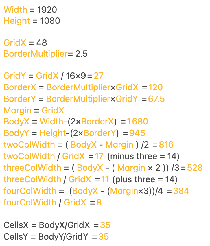
It turns out that there are three different possibilities to make a grid with perfect layout. ChatGPT worked this out using my formulas above:
| Grid x | Grid y | Border multiplier | Border width |
|---|---|---|---|
| 48 | 27 | 2.5 | 120 |
| 64 | 36 | 3.5 | 224 |
| 96 | 54 | 4.5 | 432 |
I chose the top one as the borders are too big with the others. The grid looks like this:
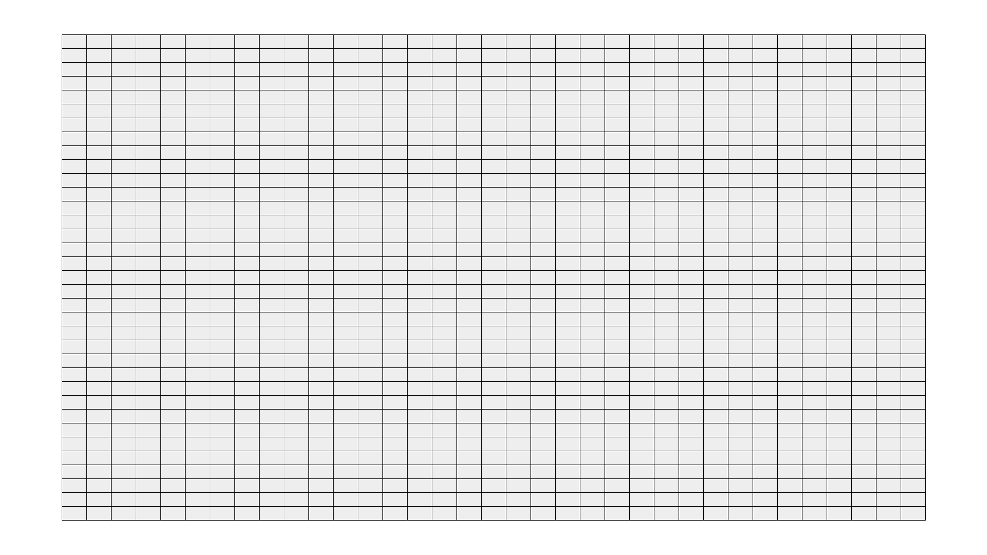
Let’s see what different layouts look like with this grid: ## Three columns This works nicely I think. An important layout. ⭐️

Single third column
This is a layout I would probably use a lot, for example for a chart plus description. Works nicely I think. Better for charts than pictures. I could put filters etc. in the left column. ⭐️

Four columns
This works too! ⭐️

Single fourth column
This works better than the single third column I think. This is even better for displaying artworks and text. ⭐️

Nine grid
These two grid layouts would be good to display multiple slides. Works ok. ⭐️
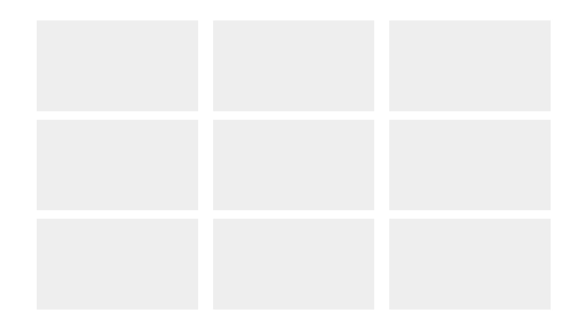 The only thing I’m wondering is, should I try to make the horizontal spacing the same width as the vertical spacing? That of course would mess things up with my chosen grid layout. Perhaps I should try and solve that in the future. For the “impossibly perfect layout system”.
Sixteen grid
This also works nicely. ⭐️

Twelve grid
Hmm. Not sure I like this one. As the boxes don’t have 16:9 ratio, it feels out of place with all the other layouts. 🤔

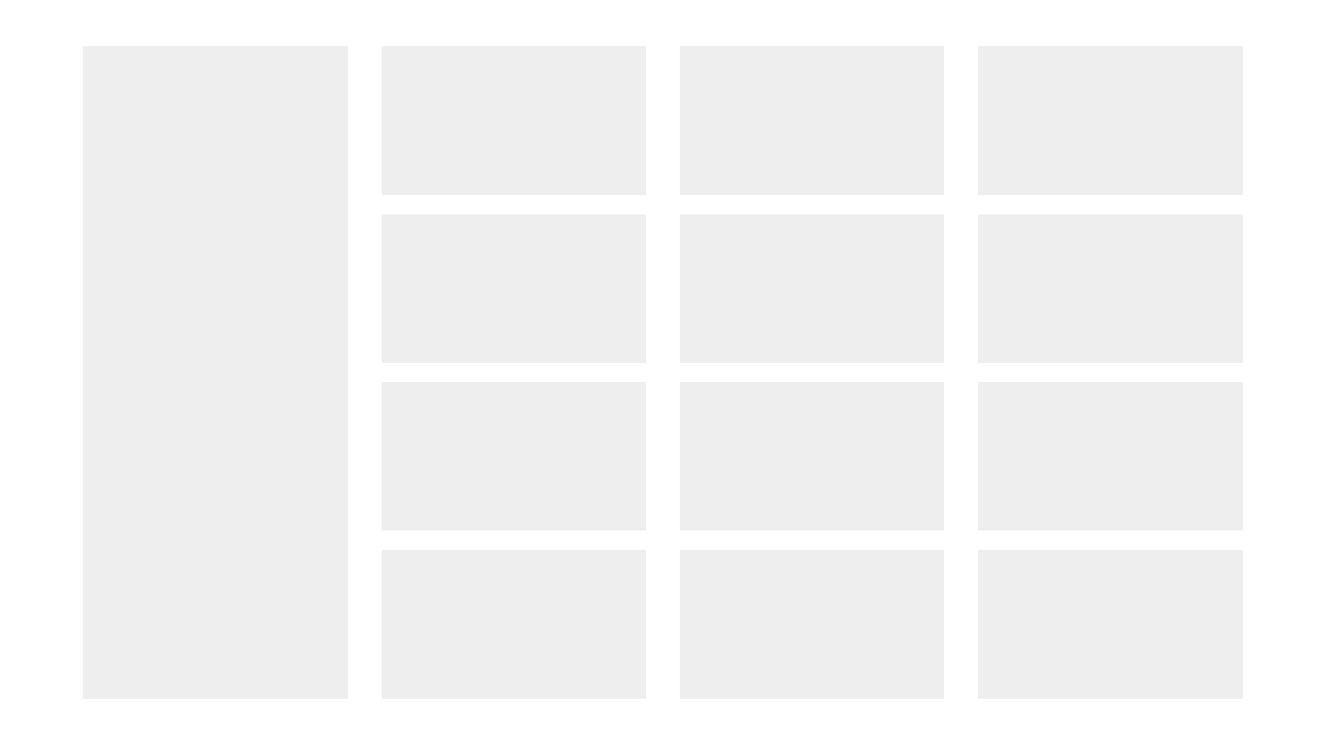
Left column plus 12 grid
To display 12 elements it might be better to do something like this, with text in the left column. I think this works better than the above. ⭐️
Twelve grid B
I guess if I had to display a lot of landscape images, this might work. Not sure I like it though. I think I may have to reject this one, except in special circumstances.

But what if I want to display various portrait images? This gets a bit trickier as we are mixing 16:9 ratio with 9:16 ratio, so this are not going to line up exactly with my grid. Let’s explore…
Three portraits plus text
A very common ratio for portraits it 3:2. Unfortunately that doesn’t work with our grid system, but let’s not worry too much about that. I think this layout works ok for displaying three portraits plus text:

Mixed layout
This works ok. The fact that the horizontal and vertical spacings are different does bug me a bit. Perhaps I’ve discovered the perfect column grid, but not the perfect row grid. I think I’ll have to return to this in the future.

A tweak: making the internal margins even
What if I keep the horizontal and vertical margins in the same place, but make the vertical one narrower and the horizontal one wider, so they are the same width? Would that look better than having the vertical and horizontal margins conform to the aspect ratio?
I calculate that if we make the margins equal, they should be 37 pixels width. Let’s mock it up in Photoshop. 

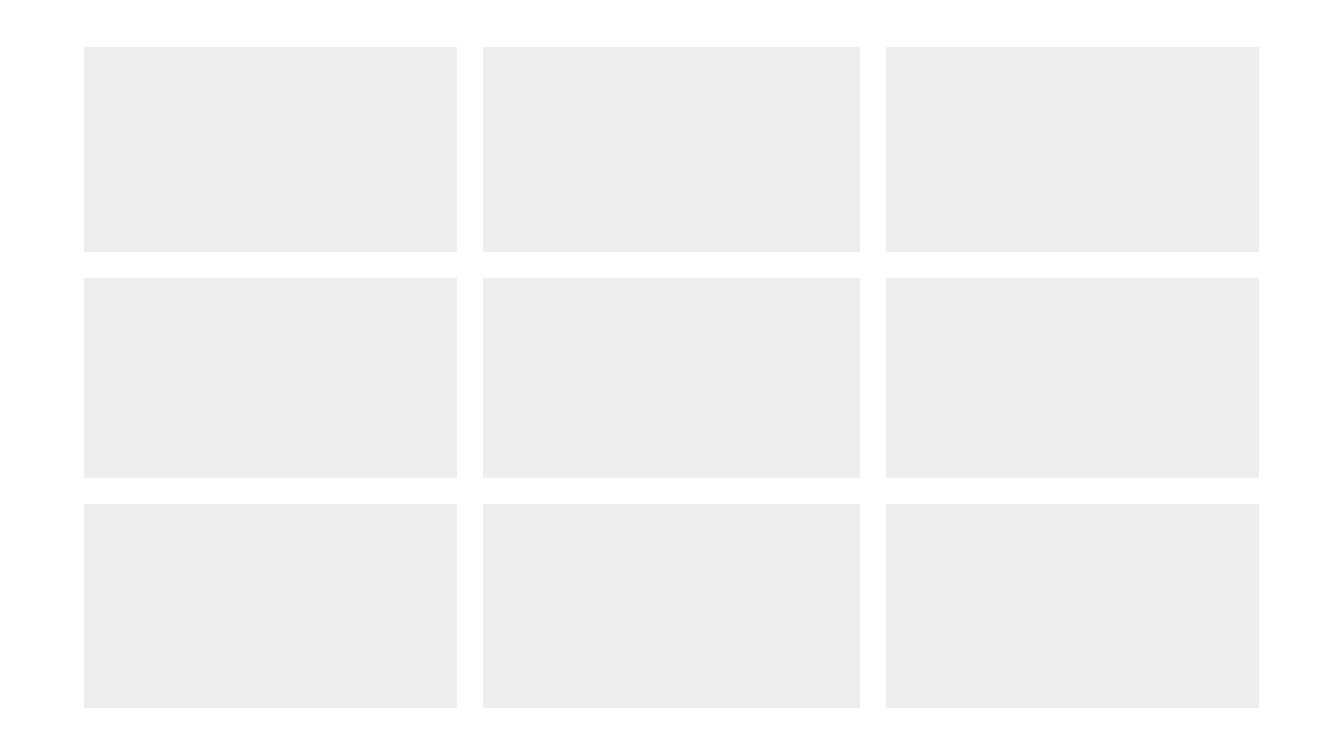
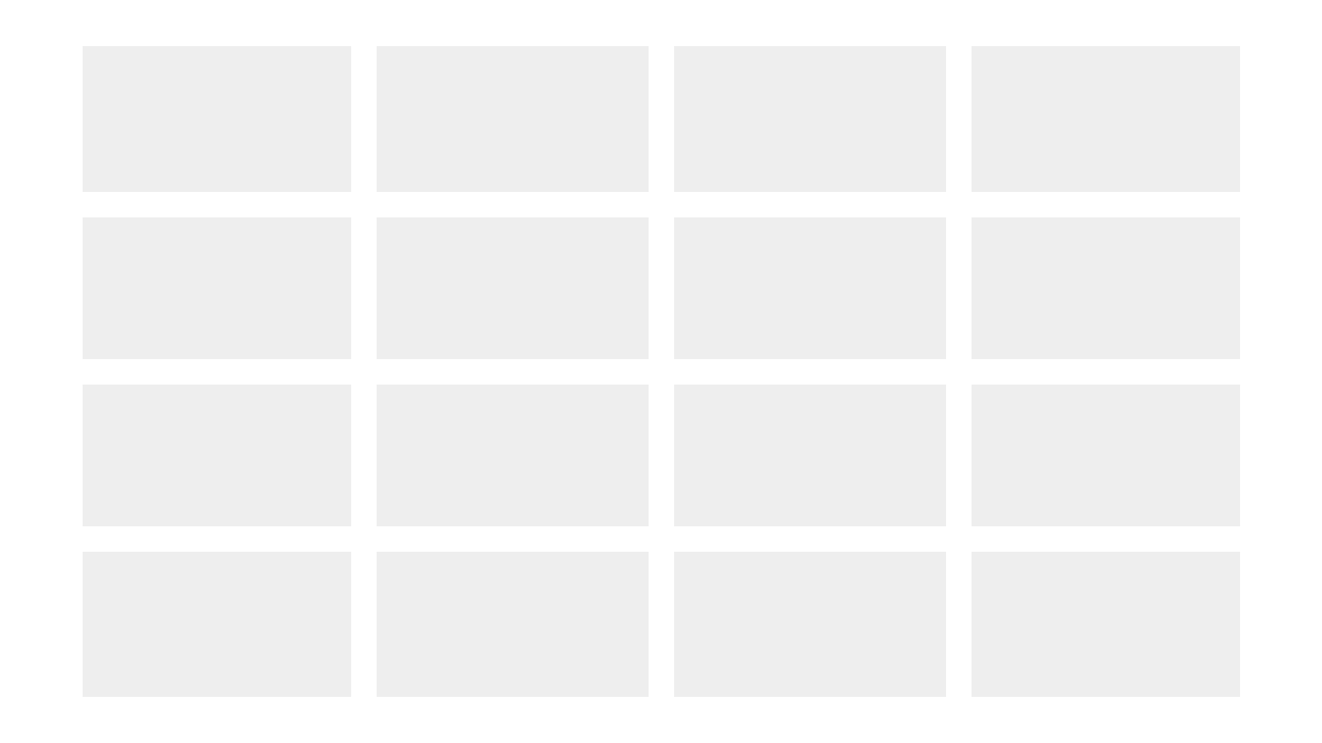

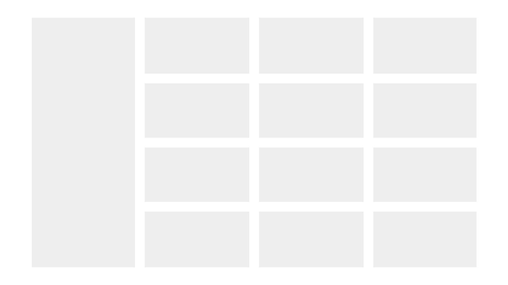



So the question is, are these better than the above? I think, on balance, the answer is yes, they are. This is what it looks like with the grid:

You can see that the layouts conform to the grid perfectly, but the margin widths do not. But I think that’s ok.
I’m done! Now we need to see what this looks like with real content…
Here’s a quick mockup with some text which conforms to the grid:
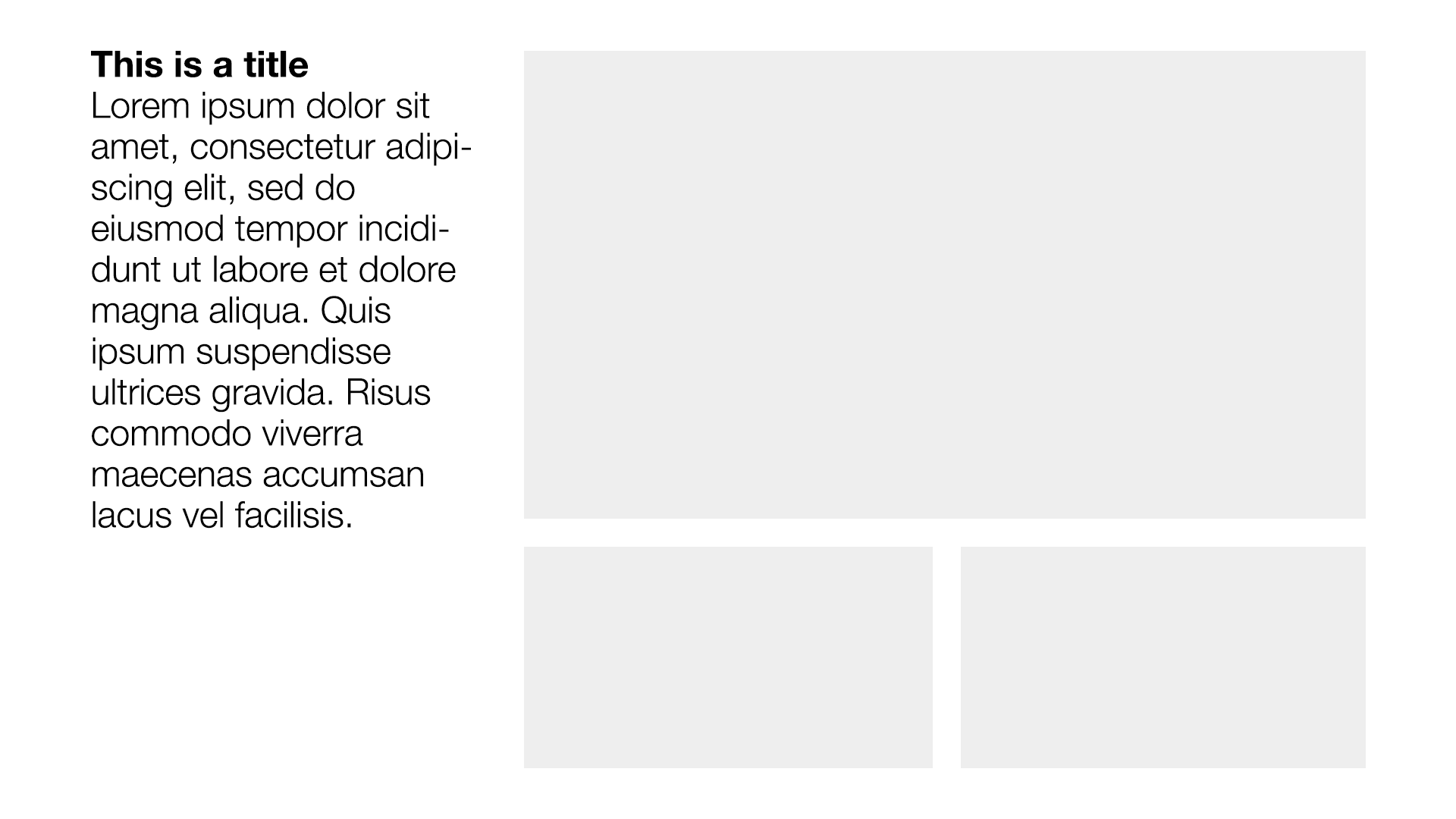
I like it! Mission accomplished.
I hope.