Creating slides with D3
I create a lot of presentations, and have been doing so for years. Over time, I have refined my methods for creating them. Currently I write the presentation in a single document (using the Bear app) and then make that document into a presentation by exporting the document in markdown and then converting that into a revealjs presentation. It works really well, and I end up with a document that contains the whole presentation and presenter notes.
I want to start incorporating diagrams and charts into my presentations created with D3. I want to make the process of creating these as neat and modular as possible. Unfortunately the Bear app does not allow embedding executable code, or embedding external HTML content. So how can I make my presentations in this way? I see three options:
- Continue using Bear to compose the essay, and have a mechanism to incorporate the slides when I convert the content for my website.
- Continue using Bear and just put in simple placeholders for the slides which I can replace by hand in the web ready version.
- Use Quarto and VS code to write my essays. My website uses Quarto anyway.
I really do like using Bear for writing my essays. It’s a really nice writing experience. I do not like using VS Code for essay writing. So, I’m going to keep using Bear for the writing. And in the short-term I’ll just use placeholders within the Bear document for the slides, which I’ll convert to the real thing at runtime. Thinking about it, for static slides I can make the placeholder a screenshot of the D3 chart, and then just leave it at that. I only need to include the real D3 version when I’m doing animation and interactivity (which I won’t do in this essay.
Creating a first slide
The resolution I use for slides is 1920x1080 (which handily is also the HDTV standard video resolution). I’m a bit fussy with things like layout — I like things to line up perfectly in a grid - so let’s first of all make a slide that is just a grid. Here’s the code:
 // Define the width, height, and grid spacing
        const width = 1920;
        const height = 1080;
        const gridSpacing = 40;

        // Append SVG to body, make it responsive
        const svg = d3.select("body").append("svg")
            .attr("viewBox", `0 0 ${width} ${height}`)
            .attr("preserveAspectRatio", "xMinYMin meet");

        // Draw vertical grid lines
        for (let x = 0; x <= width; x += gridSpacing) {
            svg.append("line")
                .attr("x1", x)
                .attr("y1", 0)
                .attr("x2", x)
                .attr("y2", height)
                .attr("stroke", "#cccccc")
                .attr("stroke-width", 1);
        }

        // Draw horizontal grid lines
        for (let y = 0; y <= height; y += gridSpacing) {
            svg.append("line")
                .attr("x1", 0)
                .attr("y1", y)
                .attr("x2", width)
                .attr("y2", y)
                .attr("stroke", "#cccccc")
                .attr("stroke-width", 1);
        }
This is the output:

That’s nice! I like it. I want to refine it a bit, let’s make every fourth line a nice blue, by having a lineColor variable like this:
lineColor = (x % (gridSpacing * 4) === 0) ? "#9999ff" : "#cccccc";That works nicely:

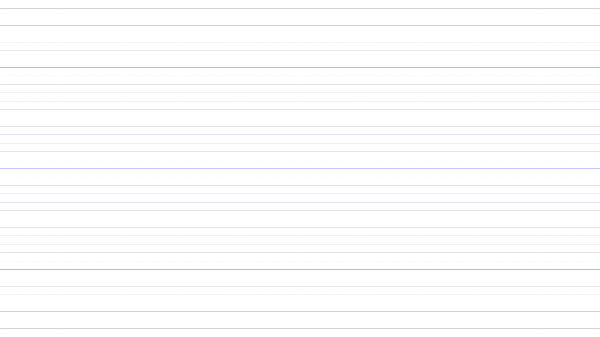
Except I don’t think this grid is exactly what I want. It’s nice that it fits the image size very precisely, but I want slides with nice borders and a central grid that can be divided up into two, three, four or six elements. How big should my borders be? I have looked into the official “safe borders” of the HDTV layout and they are 192 width and 108 height. Which gives me a thought. If I want elegant layouts, I should respect the aspect ratio and place elements accordingly. So my grid should layout should actually not be square, but with the same aspect ratio. So how about a grid size of 48 by 27 pixels. This is what it looks like:

But still not perfect. I want something I can make a 12 column layout in, where the spaces between the columns also fall on the grid. Is that even possible. Fascinating fact — 1920 is divisible by 1, 2, 3, 4, 5, 6, 8, 10, 12, 15, 16, 20, 24, 30, 32, 40, 48, 60, 64, 80, 96, 120, 128, 160, 192, 240, 320, 384, 480, 640, 960, and 1920. So we have tried both 40 and 48. Let’s try 32. That would give a cell size of 32x18.

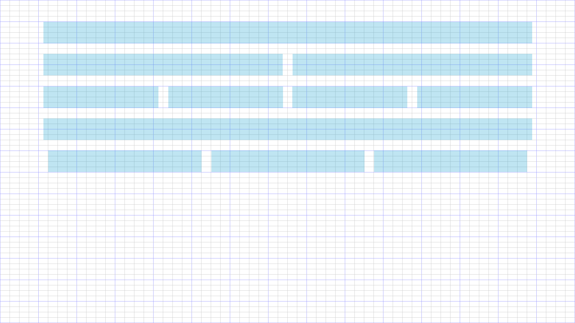
Playing around with columns in Photoshop I get this:

Notice the three column layout is slightly narrower than the other ones. Interesting. I need to think about this a bit more but I think I’m getting close to a pixel-perfect layout. But do I really need to be pixel perfect? Yes, I think I do. Horizontal and vertical lines must lie on pixels so they are not blurry.
Here’s the complete code I used to create that last grid:
 // Define the width, height, and grid spacing
        const width = 1920;
        const height = 1080;
        const xGridSpacing = 32;
        const yGridSpacing = 18;


        // Append SVG to body, make it responsive
        const svg = d3.select("body").append("svg")
            .attr("viewBox", `0 0 ${width} ${height}`)
            .attr("preserveAspectRatio", "xMinYMin meet");

        // Draw vertical grid lines
        for (let x = 0; x <= width; x += xGridSpacing) {

            if ( x%(xGridSpacing*4) == 0 )
                lineColor = "#9999ff"
            else
                lineColor = "#cccccc"

            svg.append("line")
                .attr("x1", x)
                .attr("y1", 0)
                .attr("x2", x)
                .attr("y2", height)
                .attr("stroke", lineColor)
                .attr("stroke-width", 1);
        }

        // Draw horizontal grid lines
        for (let y = 0; y <= height; y += yGridSpacing) {

            if ( y%(yGridSpacing*4) == 0 )
                lineColor = "#9999ff"
            else
                lineColor = "#cccccc"

            svg.append("line")
                .attr("x1", 0)
                .attr("y1", y)
                .attr("x2", width)
                .attr("y2", y)
                .attr("stroke", lineColor)
                .attr("stroke-width", 1);
        }