What is the perfect layout in the age of screens?
The history of book design is fascinating. Page layout has developed slowly over centuries of refinement. But what is the perfect layout in the age of screens? Landscape format for desktop, or portrait for mobile? What aspect ratio for the sides? 16:9 (like many monitors and TVs) or 4:3 (old-school TV and older screens), 19.5:9 (as common on many phones)?
More specifically (much more specifically 😂) what is the perfect layout if you wish to emulate the way William Blake created his books, with a mix of handwritten text and drawings, but for the screen?
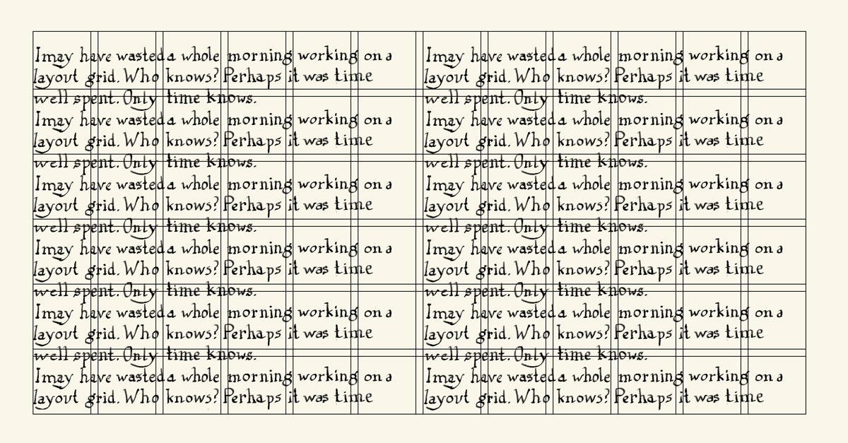
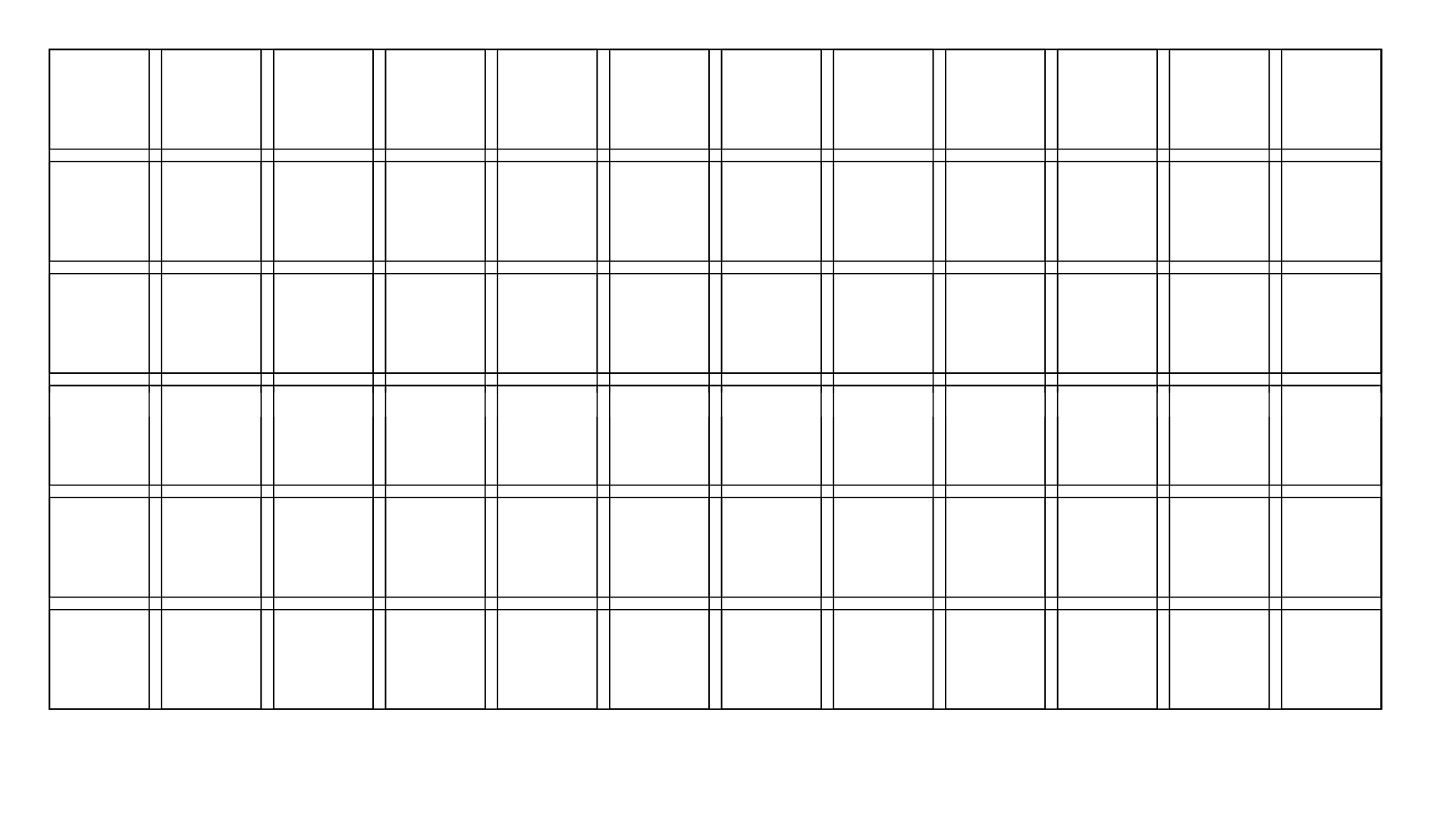
I’ve just spent a morning trying to create a perfect layout for screens. This is what I have come up with. It is HDTV resolution (1920x1080 pixels) but with margins included (margins are very important in page layout). The grid size (equal to the width of the spaces between the columns in this grid) is 32x32 pixels, which is very pleasing (if you are a computer nerd):
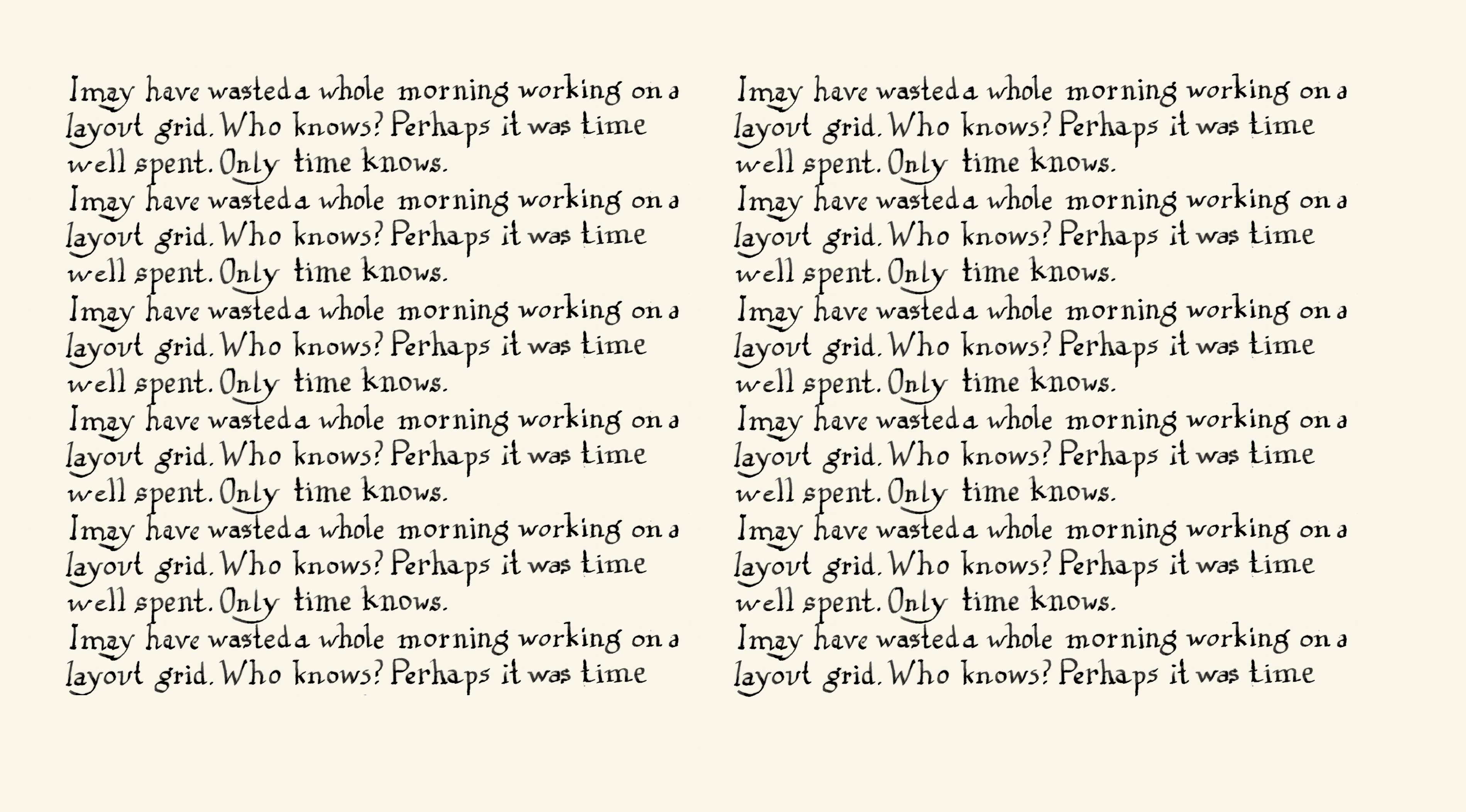
Below you can see what it looks like with handwritten text. If you click on this image it should fill the screen on your device. For mobiles it is designed to be seen in landscape format.


