Using ChatGPT as a graphic design coach
Ian Poole runs a website called Electronics Notes for electronics enthusiasts. I originally designed the website and continue to help out with advice and technical fixes.
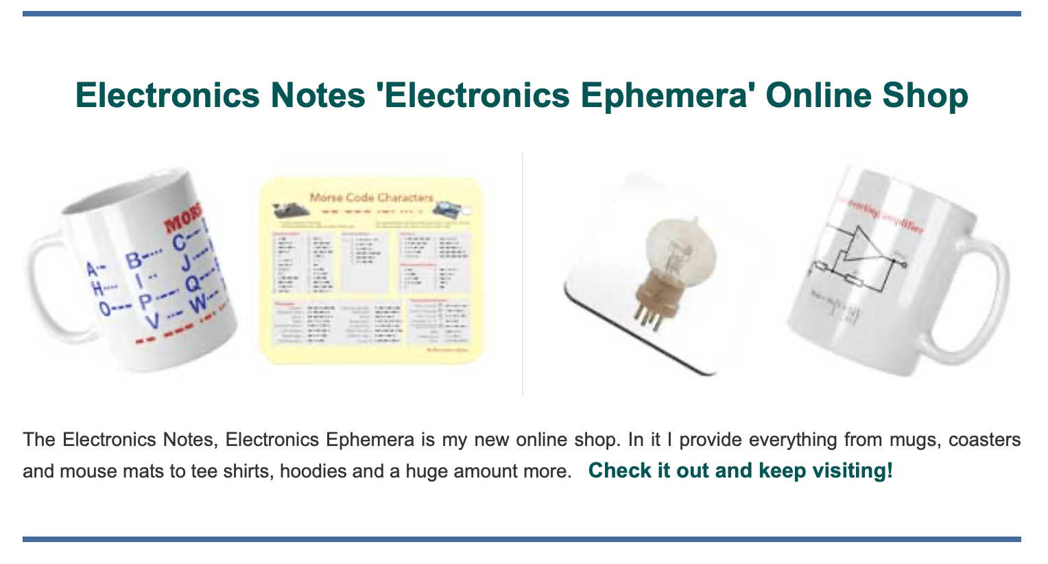
He contacted me recently because he has a new online shop for electronics related gear. He had created a section on the home page of the site to encourage people to visit the shop and asked me to improve it. This is what it looked like:
I used to do quite a lot of graphic design but I haven’t done very much for many years. I looked at the source photography and immediately spotted a problem. The items were all taken from different angles, which would make layout difficult. Here was my first attempt:
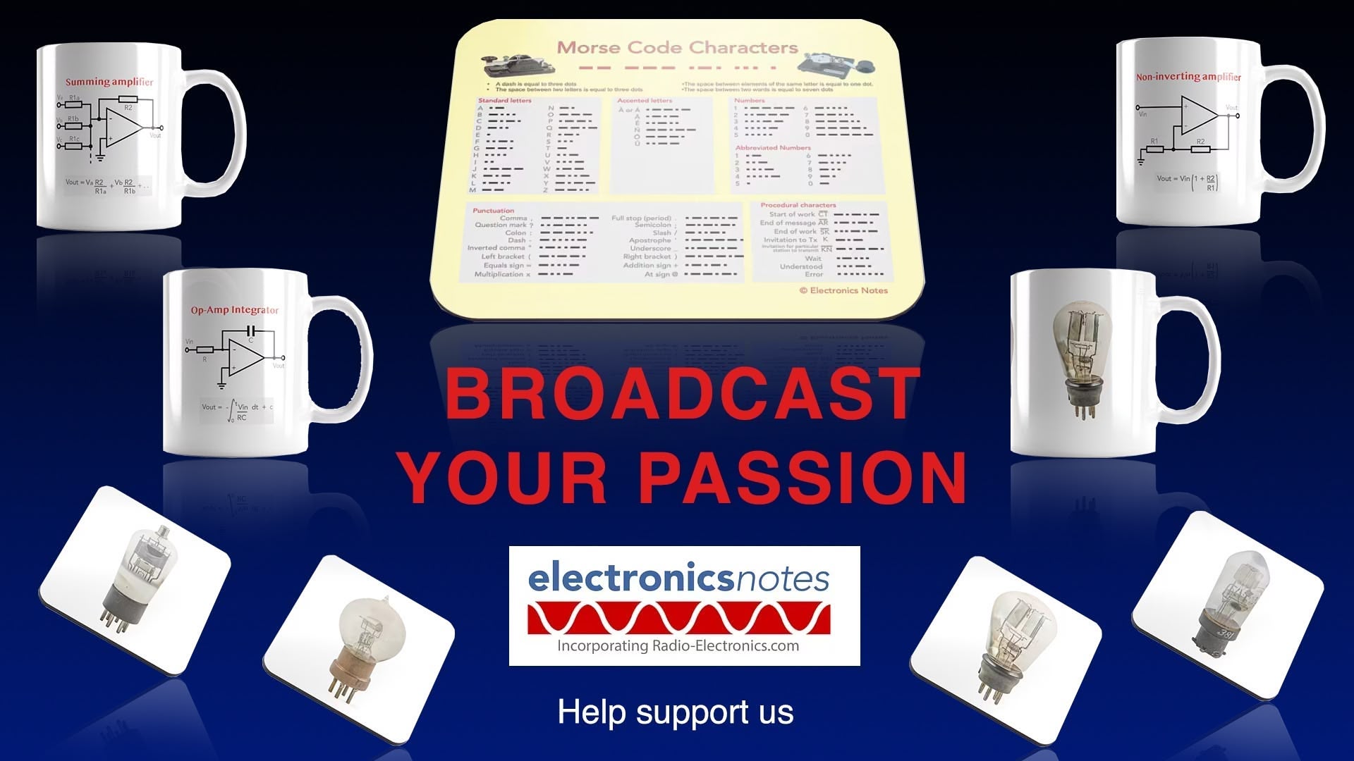
Ok, that sucks. It looks amateurish. There are a whole bunch of little rules in graphic design that if you follow then, you’ll end up with something that looks good, but I hadn’t done it for so long I had forgotten them. I had an idea—could I get ChatGPT to act as a design coach? I uploaded the design above along with this prompt:
can you critique this designCame back with a lot of comments. It started by listing things that worked, for example “Clear centre-piece message”. This it listed the things that didn’t:
- Products float around the headline, so nothing feels like the true focal point. Pick one hero item (e.g. Morse code mug) at centre; cluster supporting items smaller/ghosted.
- Red on blue screams, but the thick uppercase block can look aggressive and amateur.
- Some mugs straight, others angled; reflections vary—reads as composite rather than cohesive set.
Ok. That’s all quite useful feedback. I had another play around can came up with this:

That’s a bit better but still doesn’t look great. I moved things around again:
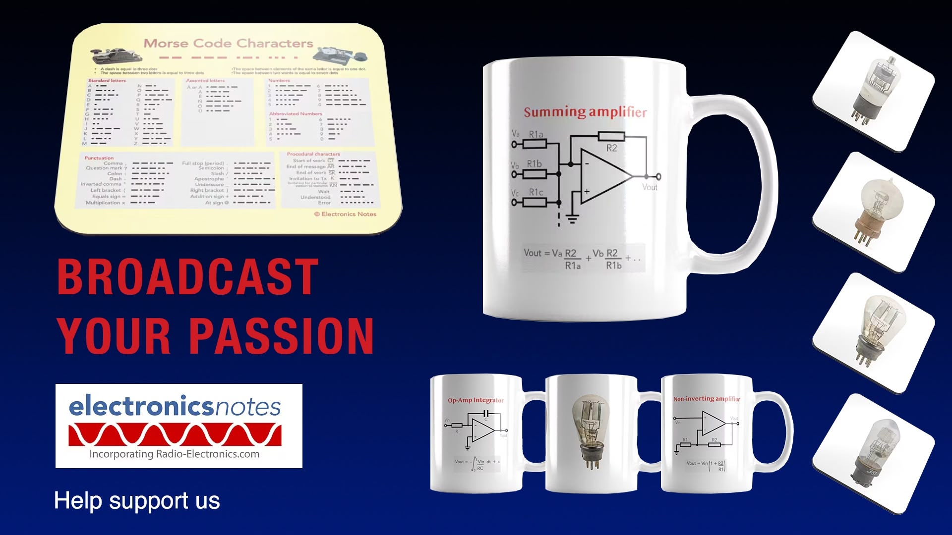
I asked it to critique this version, and in it’s response were these good points:
- Eye jumps to the mug then stalls; headline competes instead of leads.
- Red on dark blue is high contrast but long uppercase lines become a rectangle, not words.
- Cylindrical mugs face camera, coasters tipped, mouse-mat skewed—reads as a collage, not a system.
I dislike it when logos that only work on white are shown in this way so I changed that too. Another try:
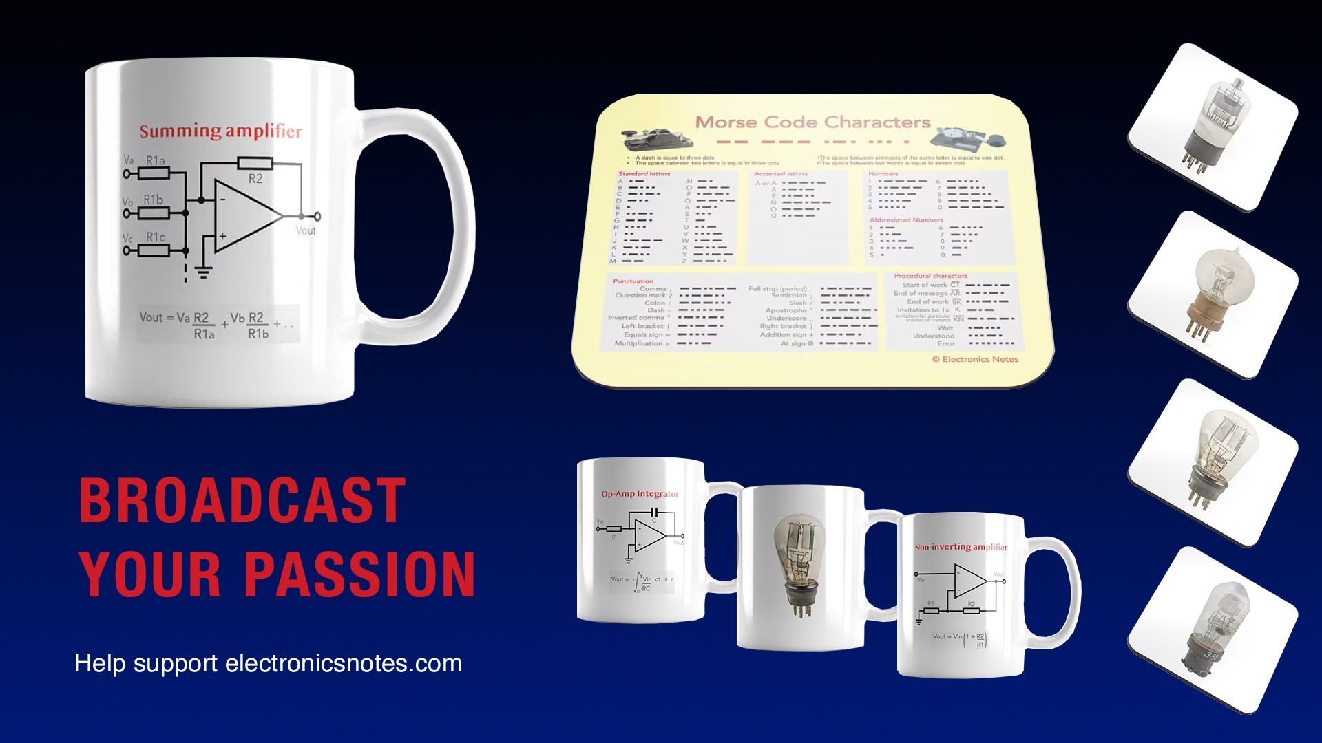
Getting closer. I got ChatGPT to critique again, and it gave a long response, most of which I ignored but I did note that it suggested I overlay the images. That seemed like a great idea, so I overlayed the mug on the mouse mat:
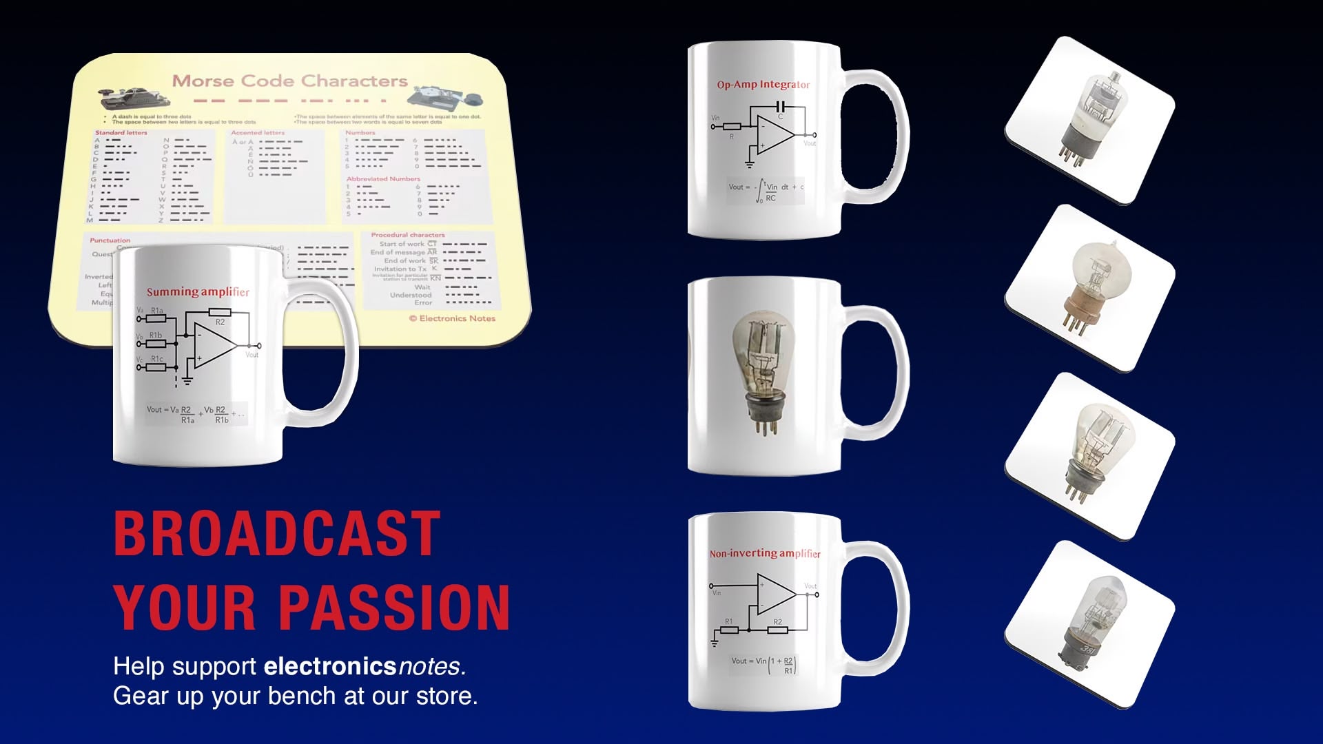
Ok, that is good enough! This exercise has brought a lot of my graphic design knowledge back, and I almost certainly wouldn’t have remembered it as quickly without ChatGPT. Although its critiques tended to be far too wordy, I was impressed with its responses and how it was able to see the whole design. Psychologists call the ability to see the whole of something composed of many elements Gestalt perception, and its impressive than a multimodal LLM is able to do it. .